Donate Local App & Responsive Web Design
Role
UX Designer, working from research to high-fidelity prototype.
Year
2021
Location
Wexford, Ireland - remote
Contact
conaill.m.odwyer@gmail.com
This project was part of my Google Certificate Course;
‘Design an app & responsive web for a charity in your neighbourhood.’
The Problem:
The pandemic has caused many charities to be left with little donations, especially at local level. People are not likely to donate to charities every week, or at all, as they find it inconvenient and some worry about their own budget. Most people don’t see donations playing a role in their everyday life.
The Goal:
Create an app, alongside a responsive web, that can make donations apart of the users everyday life, without feeling the pressure to spend lots of money.

Make every cent count with Donate Local
Project Overview
The Product:
A dedicated mobile app that allows users to pay with their card and round up the cost to save and donate to local charities. A responsive web goes along with the app that focuses on donation and fundraising.


Understanding the user
User Research
Personas
Problem Statements
Competitive Audit
Ideation
User Research: Summary:
I contacted a local charity to talk to them how the pandemic has impacted them. I found that there were restrictions with giving donations. I gathered a diverse group from the community and interviewed them about donating to charities. All wanted to help, but found it slipped their mind in their everyday life, felt pressured when approached to they didn’t think a small donation would go a long way. I wanted to concentrate on local stores, from my competitive audit I found other apps had focused on global charities. From my user feedback I found people wanted to help others in their community after such a hard hitting year but didn’t have easy access to a product that gave them that option.
Meet the Users!


User Journey Maps


Ideation using Crazy 8’s

Competitive Audit
At first, I began looking at charity and fundraising websites and apps. All had one main user goal -donate. As I began the agile working method, and after the first usability study, I began looking again at other apps who establish donations through users everyday life. ChangeDonations, Round-Up and Spare Change were direct competitors in this case. All had the system of rounding up the users purchase which they could then donate to a charity. This appealed to my user pain points established during the usability study.
Upon this audit, I found a lack of local feeling and the community wanted to help the vulnerable in their own community, but something that fitted into their everyday lives. From this, it was clear their was a gap for a round up, piggy bank and donation app that focused on local communities.

Starting the design
Paper Wireframes
Digital Wireframes
Low-fidelity Prototype
Usability Studies
Paper Wireframes
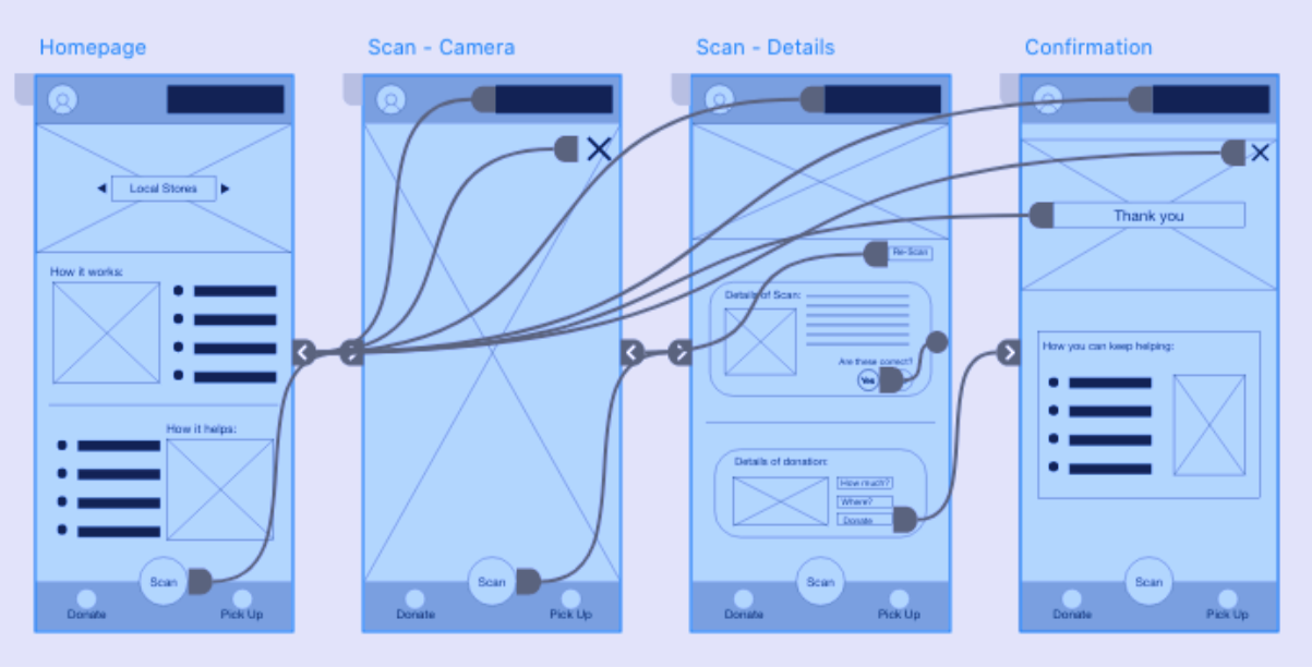
The main user flow for the app was to donate, I wanted to make a scanner that you could use while shopping or scan as you go into local stores that help vulnerable people. Below are the wireframes for the donation phase.


Digital Wireframes -> Low-fidelity Prototype
I focused on the donation button to prepare for the usability study. For the user flow, I wanted to see how users would effectively user the scan button in order for the user flow to be fulfilled.


Usability Study:
-
Function:
Users didn’t see how they could use the app in their everyday life.
-
Difficult to use:
The user flow couldn’t be finished by some participants.
-
More information:
Users wanted more information on how to use the app.
Affinity Mapping based on Usability Study


Iteration
After the usability study, I worked in the agile method and iterated based on new user insights and pain points from the existing designs.
Due to this, mockups became more user focused and I had to re-design what I initally had in mind. From looking at more direct competitors I created a more refined user flow in the mockup stage.

Refining the design
Mockups
High-fidelity Prototype
Accessibility
Responsive Design
Mockups
Before Usability Study After Usability Study

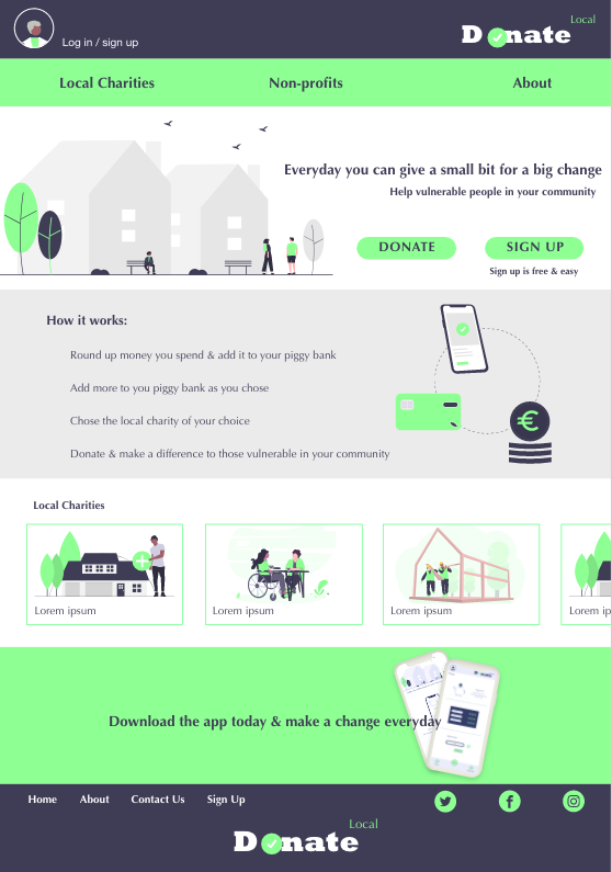
Based on user insights I made the landing page for the app more explanatory with a clear call-to-action button. I worked in the agile method as mockups were constantly being iterated on.
Before Usability Study After Usability Study

Users wanted a more seamless way to donate on the go. By creating a pay function, users could see details of their purchase and have the option to round up the change and save it to their piggy bank or add an extra bit to donate to their saved charity.

Responsive Web Designs
Sitemap
With the app designs in the mockup stage, I started designing the responsive web. I used the sitemap to guide the organisational structure of each screens design and consistent experience across devices.


Mobile
iPad

Desktop
Accessibility Considerations
-
1.
Colours were changed from the original mockups on the header and footer due to lack of contrast.
-
2.
Buttons and action buttons were used with large fonts and size to make it more obvious for those with visibility issues.
-
3.
Initial focus on the home screen helped define the primary task or action for the user.
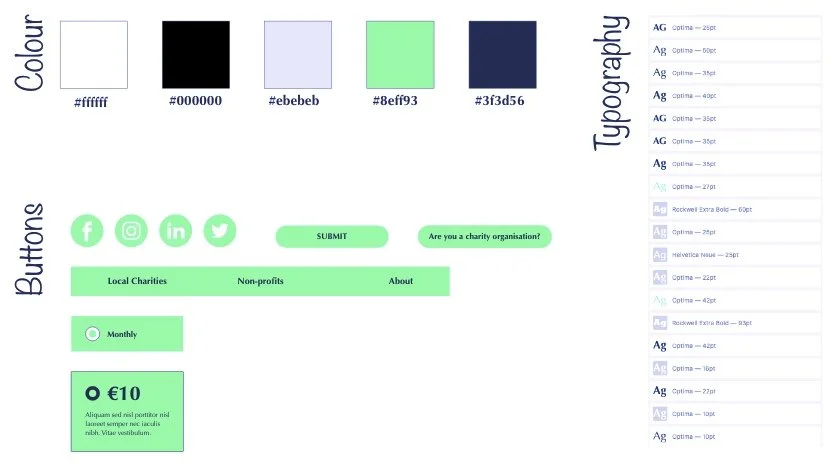
Design System:
Takeaways
Impact:
Users shared that the app would make them donate more often in their weekly shop as it was easy, convenient and fitted around their everyday life.
What I Learned:
I learned from the agile working method that designs constantly change and it is ok for your mockups to not be the same as your paper wireframes. I also realised that even though the problem I was trying to solve was a big issue, diligently going though each step of the design process and aligning that with specific user needs helped to produce solutions that were both feasible and useful.
Quote from peer feedback:
“This could be a real help to building community spirit, one that could do real change.”

Let’s connect
Thank you for taking the time to review my work. If you like what you see and want to get in touch I would love to connect.