WineHeads Responsive Web Design
Role
UX Designer, working from research to high-fidelity prototype.
Year
2022
Location
Wexford, Ireland - client based - remote
Contact
conaill.m.odwyer@gmail.com
This project began with a local client who was starting up a business for an online wine store. (Working in an agile environment, the final website became a catalogue of wines for potential clients due to a change in business strategy.)
The Problem:
Create an online wine store that was pleasing to the eye, easy to navigate and would entice people to spend a little more on their wine budget as bottles were to be sold by the case.
The Goal:
Create a response website to allow people to browse and add wines to their basket and deliver to their home in a seamless manner.

Wine Heads
for the connoisseur & the novice
Project Overview
The Product:
Wine Heads is a responsive web design for a local client venturing into the online wine store industry. It is designed for users to order wine directly from the website for delivery. The target users are 30-70 year olds who want to build their wine collection, with or without prior knowledge.


Understanding the user
User Interviews
Personas
Problem Statements
User Journey Maps
User Interviews:
I held interview with participants who were local to the area, based in Ireland. They ranged in ages 29-62, and included those who were regular wine drinkers and those who wanted to learn more about wine. Most users bought wine in-store and had never thought about buying wine online. Some commented on the old design features of some direct competitors. Users said they would be prepared to pay more for unusual wines that they wouldn’t get in local shops. Older users were more apprehensive to buy online than younger, while younger participants

Key Findings from interview
Most users had never thought of buying wine online
Users said they would pay more for a more luxury experience
Users wanted to learn about wine, even those who wouldn’t be considered wine drinkers
Younger users thought these websites were more for their parents
Older users were more cautious when buying online
All users said they would shop online using their mobile, so it is key the website is responsive, unlike some competitors
Competitive Audit

There are many online wine stores for users to use. They all have a similar check out system, the basket is in the top left corner and is easily seen. It would be important to cross over this aspect in our designs. Overall, website designs have an older feel to them. We want to create something that has a modern, fresh look to it that will appeal to users in today’s world. Imagery is hit and miss throughout direct competitors. It is important to keep images the same size and background, as this will read easier for users. Some website are not compatible on mobile devices, this will be an important distinction as we need to cater for users who might use our website on different devices. Most of the direct competitors offer gift cards, or monthly packages, targeted at weddings or birthdays. This is something we might try to add in, depending on what is achievable for the new business.
Empathy Maps
I began to pin point what users had said in empathy maps in order to see if there were any common pain points


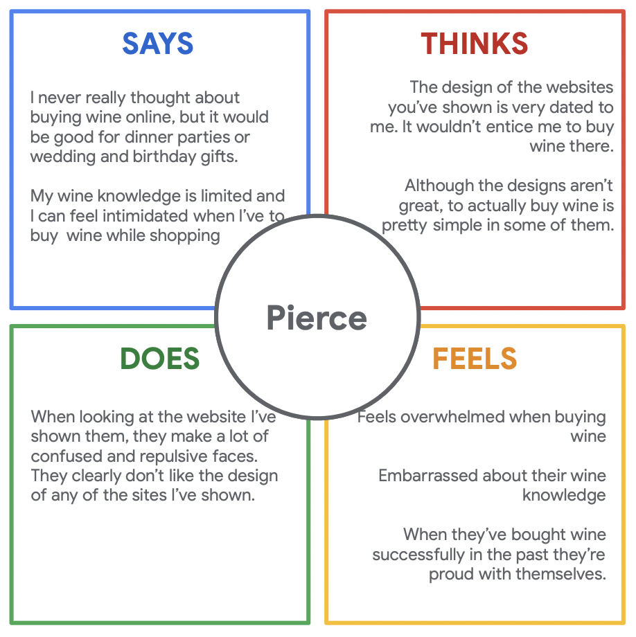

User Pain Points
Information
Users want clear information about each wine bottle, for those who want to learn what it would be good to pair it with or where does it come from etc.
Visual Element
Other online wine stores have a dated design, and images are not consistent. Users pointed this out as a distraction and found it hard to navigate some websites.
Language
Users who felt embarrassed because of their lack of wine knowledge wanted language they could understand. This way users feel welcomed on the site.
Familiarity
Some users were not averse to online shopping, so the design must be clever and familiar to users so they can easily reach the end goal.
Meet the Users!


User Journey Map

How Might We? Q’s
How might we make the online wine shopping experience more personalized and engaging for customers?
How might we simplify the wine selection process for customers who are new to wine or have limited knowledge?
How might we improve the user interface and navigation of our online wine shop to enhance the customer's browsing and purchasing experience?
How might we increase customer trust and confidence in purchasing wine online, particularly in terms of wine quality and authenticity?
How might we streamline the checkout process and make it more convenient and efficient for customers?
How might we provide better product information, such as tasting notes, food pairing suggestions, and customer reviews, to help customers make informed wine purchasing decisions?
How might we enhance the mobile responsiveness and usability of our online wine shop to cater to customers who prefer to shop on their smartphones or tablets?
How might we offer personalized recommendations and wine suggestions based on customer preferences, past purchases, and browsing behavior?
How might we improve the search functionality of our online wine shop to help customers find their desired wines more easily and quickly?
How might we leverage social media and other digital marketing channels to promote our online wine shop and engage with customers in a meaningful way?
Crazy 8’s based on HMW’s

Starting the design
Sitemap
Paper Wireframes
Digital Wireframes
Low-fidelity Prototype
Usability Studies
Site Map
Information Architecture based on user insights

Paper -> Digital Wireframes
Paper Wireframes
I developed paper wireframes for homepage, shop and gift pages. I wanted to focus on wine searches and filters to cater for different users needs.


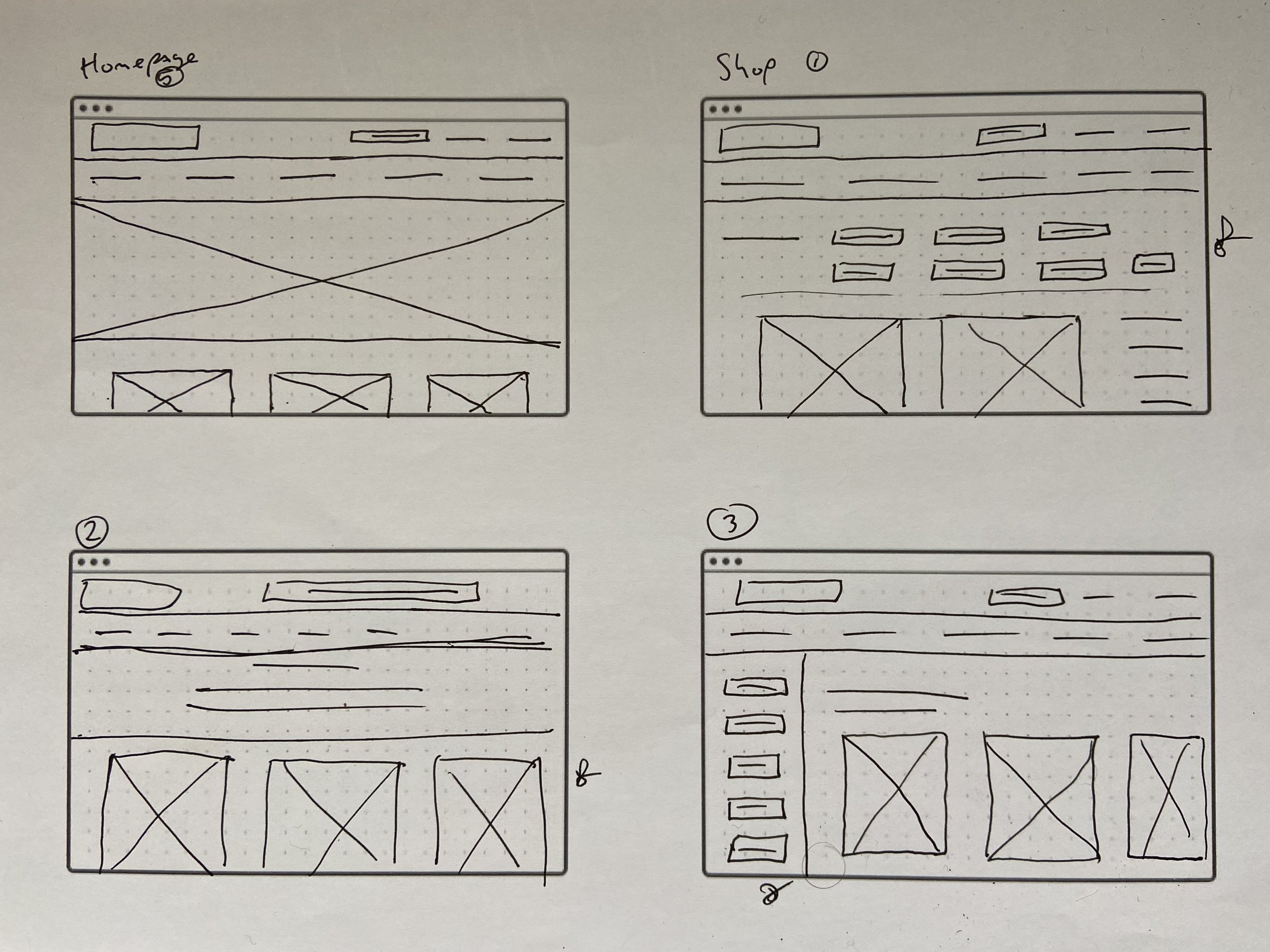

Paper wireframe for screen size variations


Digital Wireframes
End user goal was to purchase wine bottles, I focused on this main user flow for digital wireframes.


Usability Study:
-
Parameters:
Unmoderated usability study
Wexford, Dublin - remote
7 Participants
20-30 minutes
-
Findings:
Browse: Users found it hard to understand the layout of the shopping page
Change order: Users wanted to be able to change order in preview page
Layout: Users wanted a simpler layout as some users not used to online shopping wanted something easy to navigate
Refining the design
Mockups
Screen size variation mockups
High-fidelity Prototype
Accessibility
Mockups
Before Usability Study

Before Usability Study

After Usability Study

After Usability Study

Mockups - Desktop

Mockups - Mobile

Accessibility Considerations
-
1.
Colour was checked with WebAIM. I also used colour to determine call to action buttons.
-
2.
Hierarchy for text was used in order for screen to be easily read and followed.
-
3.
Focus on ‘shop’ button in the homepage highlights the main user end goal.

Design System:
Colour was limited to give a fresh and modern look. Typography had accessibility needs at the forefront, and was kept simple and clean in order for the user to achieve the end goal as easy as possible. We wanted to achieve a fresher look which would have the site stand out among its competitors.
Takeaways
Impact:
Client was please with the overall look of the website and peers commented on the visual design. I had wanted to continue iterating on designs but due to a change in strategy before launch, the company decided to go to the wholesale market. Therefore, the designs had to change quickly to meet this need.
What I Learned:
This was a great learning experience, working with a real client to develop a product to meet user needs, but also business goals. The agile working method once again became important as I had to scrap my previous work and develop a new site that was completely different from what we initial worked on.
Quote from peer:
“A great jumping off point, with a little more testing this could really stand out in the market. It brings a more sophisticated mood to the online wine market, which is missing from other sites.”
Let’s connect
Thank you for taking the time to review my work. If you like what you see and want to get in touch I would love to connect.