Art History App for Kids
Role
UX Designer, working from research to high-fidelity prototype.
Year
2021
Location
London/Ireland - remote
Contact
conaill.m.odwyer@gmail.com
‘Design an art history app for a gallery in London’
Upon initial research it was clear the biggest visitor group were children from 5-12 years. This became the target user.
The Problem:
How to make art history more inclusive and enjoyable for the target user?
The Goal:
Create an app that is easy to navigate for the user and one that gets them involved in learning

A new resource for children to educate and explore the gallery’s artwork
Project Overview
The Product:
Tate’s new art history app allows visitors and users from home to navigate through their vast collection and learn about the history of each artwork. The app is centred around child learning, where language will be easy to understand, navigation is easy to read and interactive; where users can be taught methods of drawing used in an individual art piece.


Understanding the user
User Research
Personas
Problem Statements
User Journey Maps

User Research Summary:
User Research consisted of interviews with children aged 7-12, an art co-ordinator in London and a mother of two. I showed other art apps to users to understand how they navigate through an app.
I also used secondary research from the Tate’s projects goals and quantitive research from statistics on the demographic of museum visitors.
By creating empathy maps and personas I was better able to understand the users pain points.
Initial assumptions that children wouldn’t be interested in an art history app were proven wrong during the interview process. All participants wanted to learn about different art, but all found the language difficult to understand and, also, could not navigate existing art apps.
Key Findings from interviews
Users wanted more interaction from apps
Most users found it hard to navigate the other art apps
All users wanted to learn more about art
Users responded better to images and videos, rather than text
Language would be an issue (art terms etc.)
Creating something that was safe was key
Empathy Maps based on interviews


User Pain Points
Navigation
Users find it hard to figure out where to go, whether to swipe or tap and don’t have advanced tech knowledge.
Language
Users find it hard to read text heavy pages and don’t understand art terms. Some found the text hard to see.
Interaction
Users wanted something they could get involved in. All users wanted to get more involved in the app at home.
Safety
Parents wanted something educational but safe for their child to use and be confident they could leave them with the app.
Competitive Audit

We can see that all of the direct and indirect competitors use images in their content, with some using videos as well. Their app purposes range from drawing tutorials to art tours and events.
While Drawing and Art History for Kids have a child-friendly UX and are suitable for all ages, Art Hub, gowithYAMO, ArtRabbit, and Artsy are not designed for children, and some of the apps are not interactive or have a child-friendly UX.
Although they all provide information for art lovers and drawing tutorials, there is clearly a gap in the market for an art history app that is centred around child learning, inclusion and interaction with different art works, both during visits to the gallery and at home. Most apps were not kid-friendly so there is a need for one that children can easily use and understand.
There is a great opportunity to bring real art to life for children and get them having fun through means of a different way of learning. It would also encourage more family outings to the gallery which would boost revenue.
Meet the Users!


User Journey Map


How Might We Questions
How might we create an art history app that engages kids and makes learning about art fun?
How might we design an app that allows kids to interact with artwork in a museum setting?
How might we incorporate gamification into an art history app for kids?
How might we make an art history app that is easy for kids to navigate and use independently?
How might we provide age-appropriate content and learning activities in an art history app for kids?
How might we make an art history app that encourages kids to create their own art?
How might we make an art history app that offers a personalized learning experience for each child?
How might we incorporate augmented reality technology into an art history app for kids to enhance their museum experience?
How might we make an art history app that fosters social learning and encourages collaboration among kids?
How might we design an art history app that allows parents and teachers to track their child's progress and learning outcomes?
Ideation: Crazy 8’s and Storyboarding

Starting the design
Paper Wireframes
Digital Wireframes
Low-fidelity Prototype
Usability Study
Preparing the Journey

Defining the flow with a User Flow Map to show possible actions, screens & decisions
Paper -> Digital Wireframes
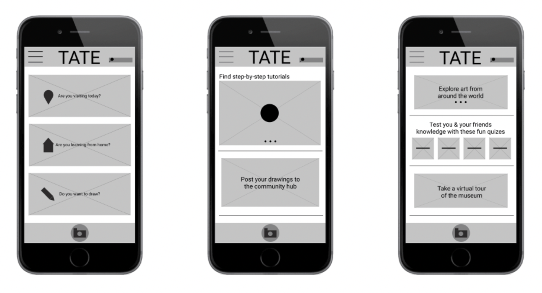
Paper Wireframes
From user research, Crazy 8’s, empathy maps and storyboarding iterated designs for different screens & user flows to address pain points.
Homepage iterations

Video page iterations

Digital Wireframes
From the paper wireframe, I continued the design process. Always keeping in mind the users pain points. I wanted to make navigation simple and use icons that could be universally understood so not to overwhelm the user.

Usability Study:
-
Parameters:
• 5 users aged 10-12
• Remote - Online, with supervision
• Users were given 5 tasks
• Users were asked a set of 3 questions to gather how the whole experience was for them
-
Test Goals:
• Can users navigate the app easily?
• Is the community hub something users would use?
• Is the app interactive enough to keep their concentration?
• Is it easy for users to follow the flow of each task?
-
Round 1 Findings:
• Users don't want the community hub as it is now
• Users want clearer navigation cues
• Users want to complete tasks quicker
• There are too many options or actions to chose from - need to create a clearer user flow
• Colour is important to most users
-
Actions to take:
• Remove the community hub
• Users want colours - bold colours to make it appealing
• Clearer CTA buttons
• Imagery and interaction continue to be the way forward
• Simplify some user flows
Affinity Mapping based on Usability Study 1


Refining the design
High-fidelity Prototype
Usability Study 2
Mockups
Accessibility
High fidelity prototype


Community hub was removed, CTA buttons were highlighted and a vibrant colour was used as per results of the usability study.
Usability Study 2:
-
Parameters:
• 5 users aged 10-12
• Remote - Online, with supervision
• Users were given 5 tasks
• Users were asked a set of 3 questions to gather how the whole experience was for them
-
Test Goals:
• Can users navigate the app better than before?
• Can users take a photo?
• Can users use the interactive tour guide?
• How do users respond to the colours and icons?
-
Round 2 Findings:
• Users didn’t understand how the burger menu worked
• There was no settings bar
• Orange and black colour on icons was hard to register for some users
• Some users weren’t sure what the camera was used for
-
Actions to take:
• A more calming colour to be used that meets accessibility needs
• Better us of icons for easier navigation
• Add a settings bar
• Remove the burger menu
• Add explanatory bubbles for new actions, such as the virtual tour
Mockups

Homepage design iterations
Changes through Usability Studies
Before & After Usability Study

Early design had a lot of options for which some found confusing. After usability study 1, I limited the options making it easier for users to find and enjoy the app. A back and homepage button were added to make navigation through the app easier.
Before & After Usability Study 2

The second usability study showed a lack of understanding when certain actins were made. I added explanatory bubbles for the map and camera so it can enhance the experience of the user.

Accessibility Considerations
-
1.
Navigation was changed from burger menu to circular call to action buttons for better clarity. Text and icons were used to give it a more universal understanding.
-
2.
Settings menu was added for language, text size, light & dark mode and display settings for contrast & brightness.
-
3.
Audio settings were included in the search menus and an audio descriptions would be available for artwork.
Design System

I moved towards a very simple colour palette, one that would not confuse the user but only enhance the experience. Yellow triggers engagements, so I thought this would be a good choice to keep users enthused. Usability played a big in role in making sure the app would be accessible for everyone. All colours were checked on webAIM.org.
Takeaways
Impact:
The app provides a safe space for kids to learn and others to embrace the world of art history; a landscape that can seem intimidating.
What I Learned:
While designing the app I’ve learned how important user research and usability studies are in order to provide a product that the user wants and can use. I found going back to initial research and goal statements to be useful to keep in mind what the app is used for to give an enjoyable experience.
Quote from peer feedback:
“The simple navigation tools and friendly wording make me feel at ease, I can imagine anyone being able to use and learn form this, no matter their knowledge of art history.”

Let’s connect
Thank you for taking the time to review my work. If you like what you see and want to get in touch I would love to connect.